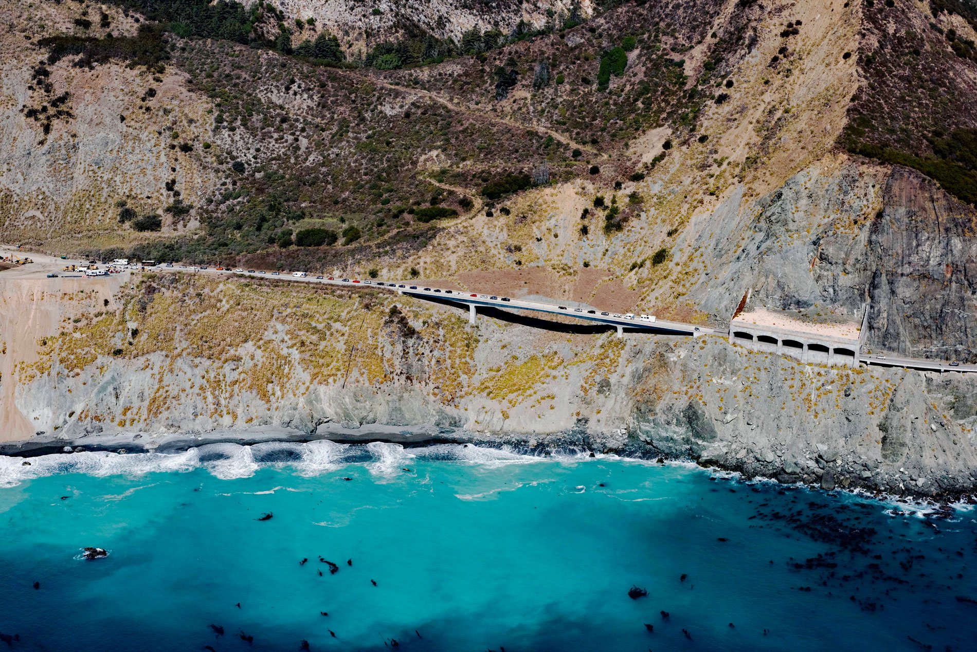
Pitkins Curve Bridge and Rock Shed are currently one of the most active landslide sites on the Big Sur Coast Highway situated just north of Limekiln State Park, about 45 miles (73 km) southeast of Monterey and 1.5 miles (2.4 km) south of Lucia, California. The area is underlain by bedrock of the Franciscan complex consisting mostly of metamorphosed sedimentary and volcanic rocks. The metasedimentary rocks are highly sheared siltstone and shale, metamorphosed to argillite or phyllite with blocks of medium-grained fractured metasandstone and greenstone or metabasalt. The metabasalt is relatively hard and erosion-resistant. Quaternary colluvial and landslide debris flow over the Franciscan rocks forming a thick sequence of crudely bedded silty sand with numerous angular cobbles and boulders. Below the roadway, fill is intermixed with this material where it was used to construct and maintain the roadway embankment. This material is derived from the upper adjacent slopes and is therefore similar to the colluvium and in most cases indistinguishable.
Historically, the California coast south of Carmel and north of San Simeon was one of the most remote regions in the state. A road was first proposed in 1894 by Dr. John L.D. Roberts, a physician who resided on the Monterey Peninsula, was summoned to assist in treating survivors of the wreck of the SS Los Angeles. The ship had run aground near the Point Sur Light Station about 25 miles (40 km) south of Carmel-by-the-Sea. The ride took him 3 1⁄2 hours using a two-wheeled horse-drawn cart, and he subsequently launched a campaign to build a road. In 1920, the 26 miles (42 km) from Monterey south to the Pfeiffer Ranch in the Big Sur valley could be completed in about 11 hours with a light spring wagon pulled by two horses. There was no road beyond the Pfeiffer Ranch, only a horse trail connecting the homesteads to the south. Funds were appropriated by the California State Legislature and federal funds were added in 1921. Construction commenced largely with prison labor, and after 18 years the paved two-lane road was completed and opened on June 17, 1937. Today, the Big Sur Coast Highway is widely considered to be one of the most scenic driving routes in the United States.
In the Pitkins Curve section, the roadway embankment has been slope-creeping since its original construction in the late 1930s. The landsliding was initially restricted to shallow failures and road repairs were made by end dumping slide debris over the side. The slopes below the roadway are subject to constant erosion by high surf at beach level and full exposure to Pacific storms. In 1998, a landslide below the roadway caused the loss of one lane. In 2000, after a series of large winter storms, the roadway was undercut and over 300 feet (100 m) was destroyed when 130,000 cubic yards (99,392 cubic m) of material failed by what was mapped as a rotational slide with the head scarp just above the road grade. The highway was relocated inland and the slope above the road stabilized. However, the excavation further destabilized the slope above the road grade and there have been numerous post-construction failures over the past several years. While these processes are more localized, there is evidence that the entire hillslope is creeping at a rate of nearly 1.3 feet per year (0.4 m/yr). In 2014, a new bridge and adjacent rock shed were constructed and the road was realigned to reduce the impact of falling rocks on the highway. Rockfall was so severe that the curve was known as Rain Rocks. The new segmental bridge is 620 feet (189 m) long and utilizes a cast-in-place pre-stressed box girder design. Read more here and here. Explore more of Pitkins Curve Bridge and Rock Shed here:

