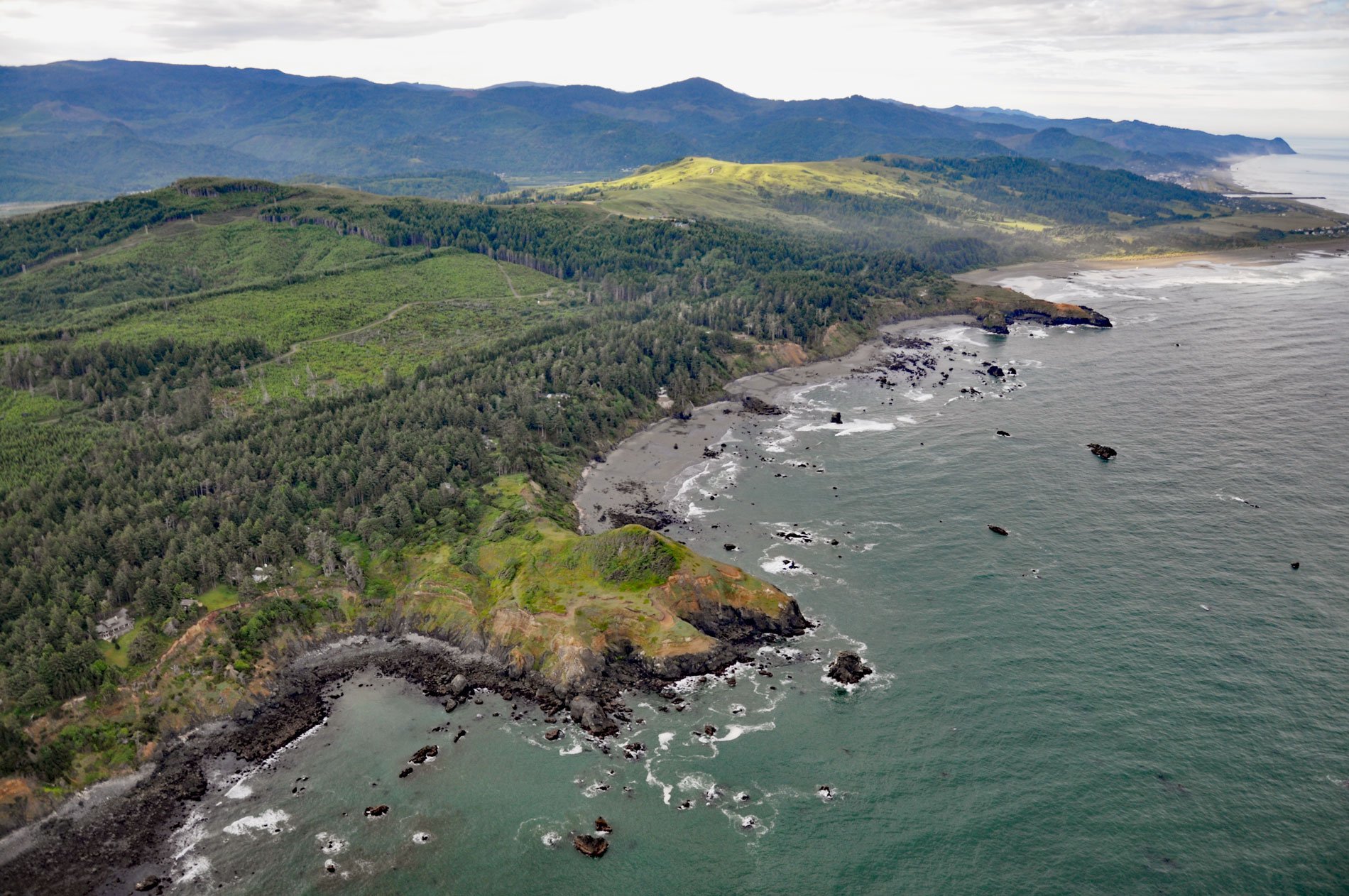
The Hubbard Mound is a coastal headland and the location of a historical beach placer mining prospect near the community of Nesika Beach, 1 mile (1.6 km) north of Otter Point, and about 6 miles (9.7 km) north of Gold Beach, Oregon. Gold was discovered in the black sand beaches of southern Oregon in 1852, and in the elevated marine terraces about 20 years later. According to local reports, these deposits were richly productive for a short time, and then were abandoned except for brief, scattered, and unprofitable ventures.
Prospectors also searched for sources of platinum and made careful studies of the mineral content of the black sand beaches of southern Oregon. They found a high abundance of minerals such as chromite, magnetite, and ilmenite. In 1926, John D. Mereen demonstrated the possibility of recovering profitable amounts of chromite from these deposits. In February 1940, terrace deposits were drilled as part of the investigation of strategic mineral deposits and the first mining of the black sands for chromite began in the spring of 1943. One of the best prospects near the Rogue River was at the Hubbard Mound. Development there included surface trenching, adits, shafts, and drill holes to collect data for estimating grade and tonnage of available ore. The ore body is 6 feet (1 m) thick and extends 60 feet (18 m) below the surface but it was not considered economically viable.
During violent storms, wave action changes the forms of beaches and the distribution of sand grains. Surface concentrations of certain minerals may be built up in a storm, only to be carried away during the next storm or dissipated by wind during the dry season. It is estimated that the beaches of southern Oregon contain 100,000 to 150,000 long tons of chromiferous sand averaging at least 5 percent chromite. However, most of the sand in these beaches contains less than 1 percent and generally regarded as barren. Read more here and here. Explore more of Hubbard Mound here:

